Funky Foam Stamps
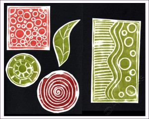
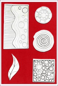
Today, just for a change, I thought I’d make some funky foam stamps to use in my backgrounds.
It’s been ages since I made any and I’d forgotten how much fun it is to make them and how versatile they can be. I know some people use wood burning tools to melt the foam, but I just use an ordinary biro pen and press really hard to make my patterns. I love the way the prints are never quite perfect – they always have a slightly distressed look from the texture of the foam. See if you can spot where I use them in my next layered background.
Hand Made Art Journal
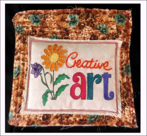
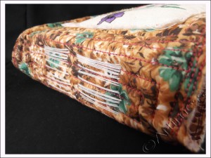
Phew! – I finally finished my latest project, a hand made art journal!
I started out by following Joanne Sharpe’s class in 21 Secrets 2013. As usual, I didn’t quite follow the instructions! Joanne taught us six embroidery stitches to use on our panels – I used three of them plus two of my own. Our design was supposed to be all embroidery, but I got rather carried away with using Twinkling H2O’s to colour my shapes! While I was busy painting and embroidering my panel, I got a newsletter from Effy Wild which gave me a link to her free Bookbinding course. Well, I had to watch it didn’t I! As a result, the journal I made is a combination of Joanne’s and Effy’s classes with a few of my own little quirks thrown in for good measure.
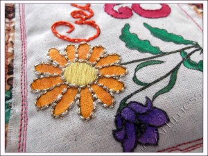
I drew the design for my book panel on some scrap paper then traced it onto calico using a homemade light box (a desk light pointed up through my glass topped coffee table) and a Pitt Artist Pen. I coloured it using a mixture of Twinkling H2O’s over clear gesso and embroidery stitches.
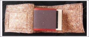
After I chose the fabric for my book cover I sat and hand tacked my wadding sandwich together so that it didn’t move about too much when I machine stitched it. I don’t know anything about quilting, but the wadding I bought was really thick, so the only way to make it manageable was to ‘quilt’ it! – I’m sure it’s not the right way to quilt, but I think it turned out alright.
Next came the pages for the journal. I started off with five signatures of watercolour paper but decided that wasn’t enough. So I added another six signatures of assorted handmade paper in a variety of sizes. I now had a small problem. Neither of the binding methods suggested would work with my enormous pile of signatures. To make matters even worse I decided to add some spacers between the signatures to allow room for expansion. My spine measured 1.5″ deep! I decided the only thing to do was to sew the signatures together in traditional binding style then somehow attach them to the cover afterwards.
I knew how I wanted the finished book to look, but had no idea how to achieve it. Once the signatures were sewn together it was easier to see what I had to do, but the technicalities of it baffled me for a while. After a lot of head scratching I decided the only way to do it would be to sew each signature into the spine individually – no mean feat with them all sewn together! But I did it, and I got the stitching to look the way I wanted it to!! Now I just have to decide what I’m going to use the journal for!
![]()
More Paper Cutting!
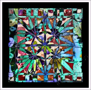
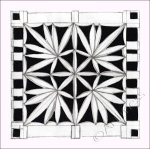
I just couldn’t resist doing some more paper cutting today. I drew the design, a kind of flower mandala, cut it out then thought it might look good with some colour. I scanned the cut out to print it, but couldn’t resist playing digital blending with it first…
… I rather like how this one turned out. After that little detour I got down to trying out some colours and decided to go ahead with them.
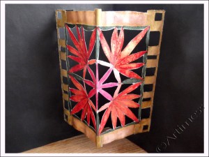
I created the mandala design on some scrap white printing paper then painted it with Twinkling H2O’s. It looked a bit anaemic on the white so I painted the background with black gesso before sticking the whole thing to black card with lo-tack double sided tape. I love the way the Twinkling H2O’s contrast with the matt black of the gesso.
![]()
Having fun!
Today I’ve been having fun trying out some new techniques and ideas.
I found this first technique in the latest copy of Craft Stamper magazine.
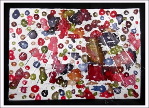
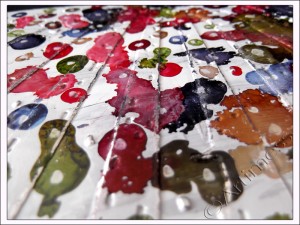
As usual I didn’t have all the suggested ingredients, so I improvised! I started by gluing a piece of baking foil to a piece of recycled packaging card, then coloured the foil white using a Uni Paint Marker. When the white marker was dry I dripped spots of different colours of alcohol ink onto the white then added white marker spots on top of the colours. As you can see – some of my spots spread a little! When all of that was dry, I embossed it using an embossing folder then sanded the edges of the embossed edges to allow the foil to shine through. Mine’s not quite as dramatic looking as the example in the magazine, but I’m still impressed with the result.
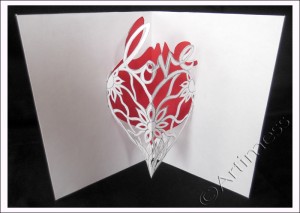
The inspiration for my second piece came from these two posts (Dimensional Paper Cut Cards and Watercolored Dimensional Paper Cut Cards) from Julie Fei-Fan Balzer. I have always loved creating pop-ups but have normally made them as add-ons to the page. The idea of cutting them directly from the page seemed too intimidating. Seeing Julie’s beautiful work inspired me to have a go.
After a few rather disastrous efforts where the middles fell out altogether or the design folded into strange places, I finally got it worked out! I drew the design using pencil, then cut it out very carefully using a pair of tiny, very sharp pointed scissors. I chose a red card to back it and stuck them together using low tac double-sided tape. I didn’t erase the pencil lines as I couldn’t decide whether or not to outline the shapes. What do you think? I’m really pleased with how this first one turned out and am itching to try another one. As Julie says on her blog – they are very addictive!
![]()
Funky Blending!
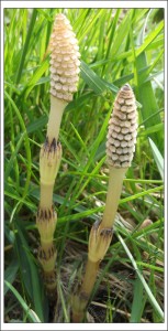
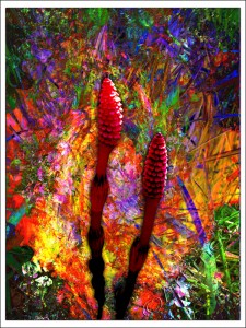
The other weekend we went to York to visit a friend and were taken to visit the city’s nature reserve. Always on the look out for a photo opportunity, I noticed these unusual plants growing just behind a bench and had to get down in the dirt to photograph them. Later, playing on the computer, I thought they would make a good subject for some funky blending.
I started with the photograph of the plants, then blended lots of layers of a scan of some leftover paint. By this time it was looking very funky, but the plants had disappeared. So I cut them out, duplicated them on top of the pile, and added some colour and blending to make them fit in with the rest of the picture. I’m very pleased with the result. What do you think?
![]()
Glitter Web Complete!
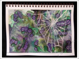
Finally, at long last, my sparkling glitter web is complete!
The photo really doesn’t show just how sparkly it is, so I’ve included this detail shot. Click on it to see the sparkles! I love working with Twinkling H20’s, but I’ve never actually used them as watercolour paints before – I must admit I struggled a bit with that! But overall I’m quite pleased with the result.
I created the background using a mixture of Twinkling H2O’s and Inktense water colour pencils; the spiders web using bleach, a glue pen and holographic glitter. Oh, and I nearly forgot the salt – but I only used a little bit of that! It sounds so simple doesn’t it – I suppose it was, I was just terrified something would go wrong!
There’s still one more part of Dion’s class to go (this lady believes in giving value for money!) – but as I don’t have any of the ingredients at the moment – it will have to wait awhile. Thank you so much Dion, it’ been brilliant so far – I’ll come back later for the last bit!
![]()
Sidetracked Again!
Ooops! – I got sidetracked again! But this Life Book lesson from Dawn DeVries Skol was just so much fun!
I started by painting the background using acrylic paint. I decided that I wanted the self-portrait to be transparent so I printed it on overhead projector film then cut it out and stuck it down using gel medium. It has left me with a slightly streaky face, but I like being able to see the background through the image. Next I added the journalling and doodling using Pitt Artist pens and coloured the large letters and doodles using neocolour crayons. Lastly I inked round the edges of the pages with a distress ink pad. Thank you Dawn for a really great lesson!
Now I really am going to get back to Dion Dior’s 21 Secrets Lesson!
![]()


