New Identity
As part of re-creating my identity back here at Artimess, I decided to design myself some business cards. The front was no trouble, but I thought I’d like to put some of my artwork on the back.
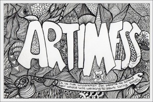
I started by creating this Artimess zentangle:
I used A6(105mm x 148mm) white art board and drew with my trusty Rotring Rapidograph .25 Pen.
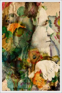
Then I found this photoshop tutorial from 10 Steps and thought it looked like fun – I love digital blending! So I gave it a go:
I love the result – mainly because it makes me look a lot younger than the original! So now I have 2 backs for my business card. Which do you think I should use?
By eunice on
Monday September 24th, 2012 at 17:07 in Artistic Ramblings, Blending Images, Digital Art, Zentangles -
Comments Off on New Identity




(Current replies are below input form)
We Respect Your Privacy. No information will ever be shared or sold.
Replies...